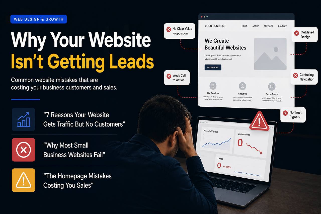
If your website gets visitors but very few calls, bookings, quote requests, or form submissions, the problem is usually not "the internet is slow" or "people are not buying." Most of the time, the website is not giving visitors enough reason to trust you, understand your offer, and take the next step.
This is frustrating because traffic feels like progress. You can see people landing on the site, but if they leave without becoming leads, the website is acting more like a brochure than a sales system.
At Weblud, we build websites for businesses that need more than a nice design. The goal is simple: make your website easier to find, easier to trust, and easier to act on.
1. Your homepage does not explain what you do fast enough
Most visitors decide whether to stay within a few seconds. If the first section of your homepage is vague, clever, or overloaded, people may leave before they understand why your business matters.
A strong homepage should quickly answer:
- What do you offer?
- Who is it for?
- What result do you help them get?
- Why should they trust you?
- What should they do next?
Many small business websites open with phrases like "solutions for the modern world" or "we bring your vision to life." Those lines sound polished, but they do not help a busy customer decide.
A better homepage is specific. If you build websites, manage ads, offer dental services, repair roofs, provide legal help, or run a local clinic, say it clearly. The visitor should not have to solve a puzzle before contacting you.
2. Your calls to action are weak or hidden
A website that does not ask for action will usually not get action.
Your call to action should be obvious, repeated, and connected to what the visitor wants. If the only button is buried at the bottom of the page, or if every button says something generic like "Learn More," you are making the customer work too hard.
Good calls to action include:
- Book a free consultation
- Request a quote
- Get a website audit
- Schedule an appointment
- Call now
- Start your project
The best CTA depends on the business, but the principle is the same: make the next step clear and low-friction.
For service businesses, Weblud usually recommends placing a primary CTA near the top of the page, after key proof sections, inside service pages, and again near the final decision point.
3. Your website looks good, but does not build trust
Good design matters, but design alone does not create leads. A beautiful website can still fail if it does not make the visitor feel safe.
Trust signals are the proof that your business is real, capable, and worth contacting.
Useful trust signals include:
- Google reviews and testimonials
- Before-and-after examples
- Case studies or project results
- Real team photos or founder information
- Clear contact details
- Business location or service area
- Guarantees, process explanations, or FAQs
- Logos of clients, tools, partners, or certifications where relevant
A visitor is often thinking, "Can I trust this company with my money, time, home, business, or health?" Your website needs to answer that before asking for the sale.
4. Your service pages are too thin
Many businesses have a homepage and a contact page, but weak service pages. That is a major lead-generation problem.
A service page should not just list the service. It should explain the problem, the outcome, the process, the benefits, the proof, and the next step.
For example, a web design service page should answer:
- What kind of websites do you build?
- Who are they for?
- What is included?
- How does the process work?
- How does the website help generate leads?
- Why choose your company instead of a cheap template or freelancer?
- What should the visitor do if they are interested?
Thin service pages also limit SEO. If Google cannot clearly understand what each page is about, and visitors cannot see enough helpful information, the page has a harder time ranking and converting.
5. Your offer is not clear enough
Sometimes the website is not the only issue. Sometimes the offer itself is unclear.
Visitors need to understand what they are getting and why it matters. If your website lists every possible service without structure, people may feel confused instead of convinced.
A clear offer should communicate:
- The main problem you solve
- The audience you serve
- The outcome you help create
- The reason your approach is different
- The first step to work with you
This is especially important for agencies, consultants, contractors, clinics, and professional services. If the visitor cannot explain your offer in one sentence after reading your page, the page probably needs work.
6. Your forms ask for too much too soon
Long forms can reduce leads, especially when the visitor is still early in the decision process.
If your contact form asks for too many details, requires unnecessary fields, or feels like a chore, visitors may abandon it. The job of a lead form is not to collect every possible detail. It is to start the conversation.
A practical lead form usually asks for:
- Name
- Email or phone number
- The service they are interested in
- A short message
You can collect deeper details after the first contact. Make the first step easy.
7. Your website is slow or awkward on mobile
Many business owners check their website on a laptop, but customers often visit from a phone. If the mobile experience is slow, crowded, or hard to tap, leads disappear.
Common mobile issues include:
- Buttons that are too small
- Text that is hard to read
- Menus that feel clunky
- Large images that load slowly
- Forms that are annoying to complete
- Important CTAs pushed too far down the page
A lead-generation website needs to feel smooth on mobile because that is where many decisions happen. Someone might be comparing businesses while sitting in a car, on a lunch break, or after seeing your ad on Instagram.
8. You are attracting the wrong traffic
Not all traffic is equal. A website can get visits and still produce no leads if the traffic does not match the offer.
This can happen when:
- Blog topics attract people who are researching, not buying
- Ads target broad audiences instead of qualified customers
- SEO keywords do not match commercial intent
- Social media sends curious visitors who are not ready to act
- The landing page does not match the message that brought them there
The fix is not always "get more traffic." Sometimes the fix is to improve the traffic quality and align each page with the visitor's intent.
For example, someone searching "cheap website Toronto" may need affordability and trust. Someone searching "website redesign agency" may need proof, process, and results. The page should match the mindset.
9. Your landing pages do not match your ads
If you run paid ads, the page after the click matters as much as the ad itself.
A common mistake is sending every ad to the homepage. That can work sometimes, but if the ad promises a specific service, location, or offer, the landing page should continue that exact conversation.
A strong landing page should include:
- A headline that matches the ad promise
- A clear explanation of the offer
- Proof and testimonials
- Benefits, not just features
- A simple form or booking option
- One primary call to action
When the message is consistent from ad to landing page, visitors feel like they are in the right place. That improves conversion rates.
10. You are not answering objections
Visitors often have quiet objections before they contact you. If your website ignores those objections, people leave to keep researching.
Common objections include:
- How much will this cost?
- How long does it take?
- Can I trust this company?
- What happens after I contact you?
- Is this right for my business?
- Have they helped businesses like mine before?
- Will I be locked into something complicated?
You do not need to answer every detail on every page, but you should remove the biggest doubts. FAQs, process sections, testimonials, and clear service explanations can help a lot.
A simple lead-generation checklist
If your website is not getting leads, start with this checklist:
- Make the hero section clear and specific.
- Add one strong primary call to action.
- Place CTAs throughout the page, not only at the bottom.
- Add testimonials, reviews, or case studies near decision points.
- Strengthen every important service page.
- Simplify the contact form.
- Improve mobile speed and readability.
- Match landing pages to ads and search intent.
- Add FAQs that answer real customer objections.
- Track form submissions, calls, bookings, and conversion rates.
This is how a website moves from "online presence" to actual business asset.
Final thoughts
Your website is not supposed to just exist. It should help people understand your business, trust your offer, and take action.
If your website is getting traffic but not customers, the answer is usually a mix of clearer messaging, stronger trust signals, better calls to action, faster mobile performance, and service pages built around real customer intent.
Weblud can help you turn a website that looks fine into a website that actually generates leads. Visit the Weblud services page or contact Weblud to talk about improving your website strategy, design, SEO, and conversion path.